Pedro Reis Team
Pedro Reis Team
Pedro Reis Team is a Brazilian nutrition program focused on weight loss. The logo needed to feature the founder's name in capital letters and also convey the idea of connection and movement, alluding to the program's goal: to make people healthier as a group.
Pedro Reis Team is a Brazilian nutrition program focused on weight loss. The logo needed to feature the founder's name in capital letters and also convey the idea of connection and movement, alluding to the program's goal: to make people healthier as a group.
logotype
logotype
2023
São Paulo, BR

For this project, I sketched out some ideas on paper, refined them in Illustrator, and finalized the branding by adding colors commonly used in the fitness industry and typography.
For this project, I sketched out some ideas on paper, refined them in Illustrator, and finalized the branding by adding colors commonly used in the fitness industry and typography.


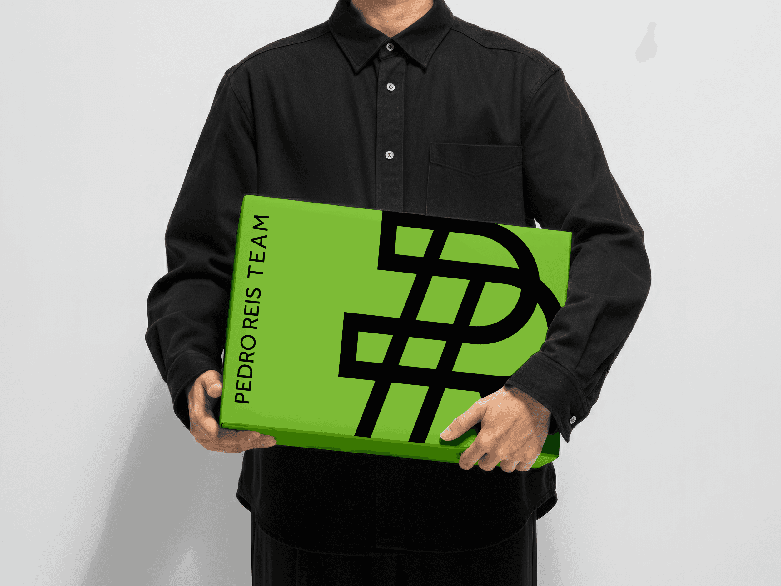

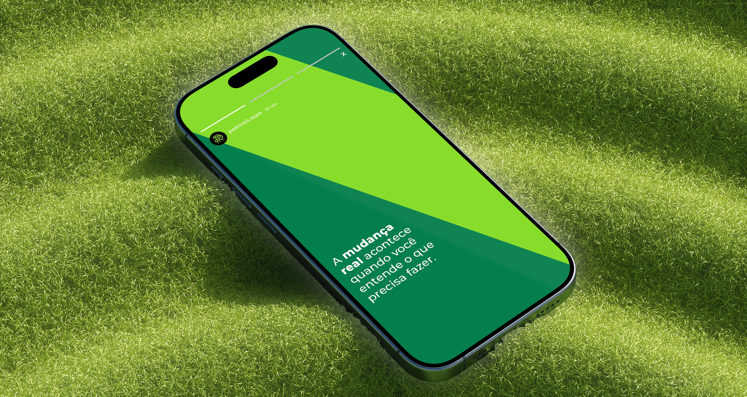
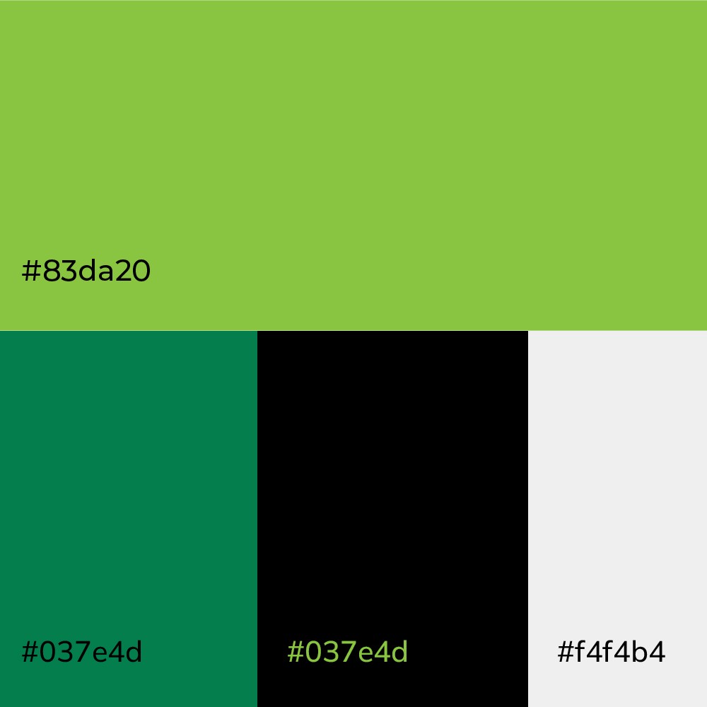
As the client request, the color palette is based on a vibrant green and black. In addition to these colors, I chose another shade of green and use a touch of white.
The font family chosen was a regular sans serif clean web font, once the main necessity of the brand is to communicate clearly on social media and in nutritional protocols.